
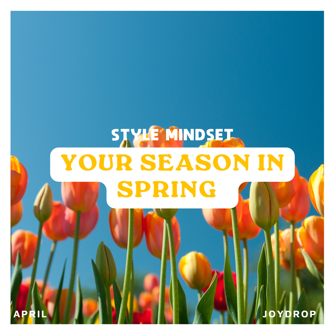
Your season in spring
I know all you Springs and Summers are desperate for the warmer weather to arrive. It somehow just feels easier to dress in your season when the weather matches it.
But actually… there isn’t really any reason for that.
Your colours don’t suddenly stop working just because it’s a different time of year. The only real difference is what’s in the shops, and in autumn especially, you’ll notice a lot more warm, earthy tones, which naturally work well for Autumn palettes.
So instead of waiting for the season to match your colours, I wanted to show you how to make your palette work now — with some simple, wearable colour combinations you can start using straight away.
Spring
This is where things tend to feel easiest, your colours naturally show up more at this time of year.
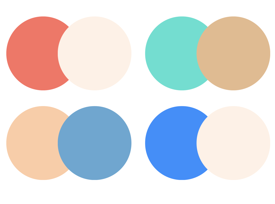
You want to fully embrace the spring brightness, but balance it so it still feels wearable.
Colours to lean into:
Coral
Peach
Turquoise
Light denim blue
Warm white
Then try combinations like:
Coral + cream
Turquoise + tan
Peach + light denim
Bright blue + cream
Notice how each outfit has one brighter colour, balanced with a lighter or more neutral base.
Summer
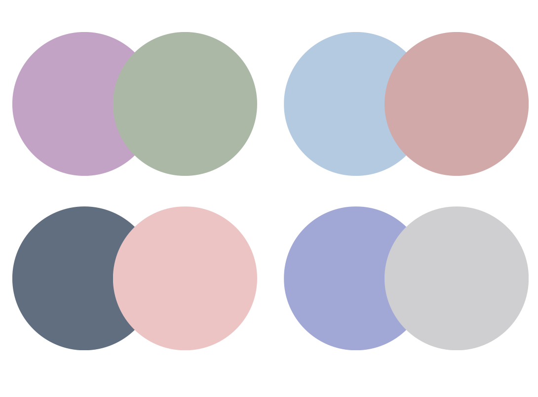
As the weather gets warmer, it can be tempting to either go too bright or stay too muted.
Summer works best when things stay soft, but still have enough contrast to feel put together.
Colours to lean into:
Powder blue
Blush pink
Lavender
Soft white
Light grey
Then try combinations like:
Lavender + soft sage
Powder blue + dusty rose
Soft navy + blush pink
Periwinkle + cool grey
Notice how the contrast is gentle, nothing feels stark, but it’s also not all one flat tone.
Autumn
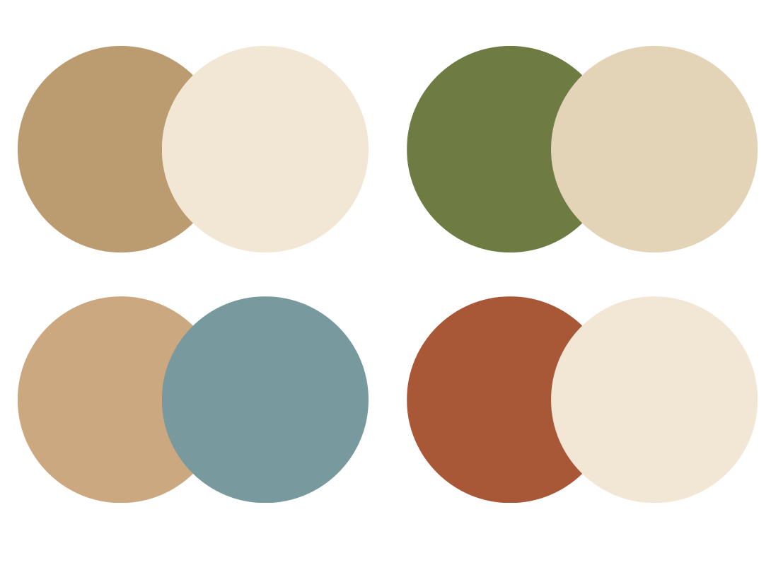
Autumn colours can start to feel heavy if you wear them in the same way you would in winter. Instead of changing your colours, focus on lighter pairings and less depth in each outfit.
Colours to lean into:
Camel
Warm beige
Olive
Soft teal
Cream
Then try combinations like:
Camel + cream
Olive + warm beige
Soft teal + tan
Rust + cream
Notice how these use at least one lighter colour, rather than pairing lots of dark tones together.
Winter
As the weather gets warmer, it’s really easy to start softening your colours. But Winter is one of those seasons that still needs contrast to feel right.
Think:
Cobalt
True red
Emerald
Crisp white
Light grey
Then try combinations like:
Navy + white
Cobalt + Fuschia
True red + denim
Emerald + white
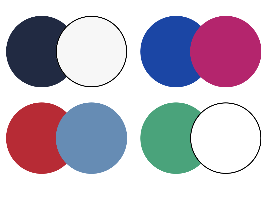
Notice how these all keep a clear contrast between light and dark, just without heavily relying on black.
Related JoyDrops:
If you are loving all the Style mindset JoyDrops then you might want to take a peek at these other articles:
Uncanny Vally - Looking at how the celebrity's of today have changed so drastically from the 00’s and why that is
Is something basic ruining your look - A look under the clothes, yes this joy drops all about underwear